


What are my Options?
The ideal way to achieve mobile friendliness is to build your website with a fully responsive design – JSWeb’s expert team offers new builds that are now built in that way. But what if you have an established site that is not mobile friendly? How do you keep up to date? You have 3 standard options: Option 1. Incorporate a readymade template which is cheap to buy. Option 2. Convert your existing site and design to fully-responsive. Option 3. Start afresh with a brand new modern design and build. By “readymade” we mean from places that specialise in creating templates and mass selling them. These can appear to be very cheap at first glance but although the actual installation should be straightforward, there is always a considerable amount of time and effort required in configuration to bring it to the required state of branding – something that is not always made obvious by the vendor of the template! Option 1: Somewhere between 15- 20 hours work is normally involved in implementing a template to an existing site, costing between £975-1300 Option 2: Converting an existing site to responsive is normally around 25 hours (about £1600). If you have a complex custom design or build, then the price is more likely to be in the region of £2600 but we’d need full details of requirements before giving an accurate quote. Option 3: Starting from £3000 – rebuilding your site from scratch with a modern, responsive design. Take the step forward and get the traffic and business you deserve. Remember, your site is your shopfront! Make sure it isn’t dated!Will It Really Affect Me?
 Not having a responsive site these days is a major drawback. We can’t stress it enough! Google now take into account mobile accessibility as a major factor for mobile searches. The rate of increase in mobile browsing and mobile/tablet e-commerce over the past year is astonishing. Sites that do not work well on the billions of phones across the globe are losing out on conversions and ultimately return on investment.
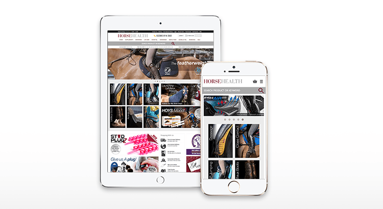
Converting to responsive design is a one time, long term investment. One that really pays off. When you visit a site on your mobile that is not responsive, it is extremely annoying to scroll and zoom to see the pages and information you want, not to mention trying to complete a transaction. You really do lose customers because of the difficulties with the client experience. If your clients appreciate your existing theme and build, then it is only logical to continue with what you have, but making it user-friendly on all devices. The reason converting it takes so long – and therefore costs what it does – is that your current build is based for the most part on fixed dimensions, and everything needs to be altered to use percentages of available space.
We know it’s not easy to hand over so much money, but we can set up a payment plan where you pay a deposit and then pay the rest over a number of invoices. This way it’s accessible to all of our clients regardless of their budget.
Not having a responsive site these days is a major drawback. We can’t stress it enough! Google now take into account mobile accessibility as a major factor for mobile searches. The rate of increase in mobile browsing and mobile/tablet e-commerce over the past year is astonishing. Sites that do not work well on the billions of phones across the globe are losing out on conversions and ultimately return on investment.
Converting to responsive design is a one time, long term investment. One that really pays off. When you visit a site on your mobile that is not responsive, it is extremely annoying to scroll and zoom to see the pages and information you want, not to mention trying to complete a transaction. You really do lose customers because of the difficulties with the client experience. If your clients appreciate your existing theme and build, then it is only logical to continue with what you have, but making it user-friendly on all devices. The reason converting it takes so long – and therefore costs what it does – is that your current build is based for the most part on fixed dimensions, and everything needs to be altered to use percentages of available space.
We know it’s not easy to hand over so much money, but we can set up a payment plan where you pay a deposit and then pay the rest over a number of invoices. This way it’s accessible to all of our clients regardless of their budget.
Do I REALLY need to change?
We could talk at you all day and quote statistics left, right and centre, but there is a very simple test that you can do – go to your own website on your mobile phone and try to place an order. Get in touch by submitting a ticket in your client area at my.jsweb and we’ll be happy to help!How Does Responsive Design Impact WordPress and WooCommerce?
A responsive website is particularly important for WordPress and WooCommerce websites. These platforms are widely used for building and managing websites and online stores. By ensuring that your WordPress website or WooCommerce store is responsive, you can provide an optimal user experience across various devices.
A responsive design automatically adjusts your website’s layout, images, and content to fit different screen sizes, such as desktops, laptops, tablets, and smartphones. This flexibility allows your WordPress or WooCommerce site to be easily navigated and visually appealing, regardless of the device used to access it. With more people browsing and shopping on their mobile devices, having a responsive website built on WordPress or WooCommerce is crucial for engaging and retaining visitors.
In addition, a responsive WordPress or WooCommerce website can positively impact your search engine rankings. Search engines like Google prioritise mobile-friendly websites in their search results. By using a responsive design, you avoid needing separate mobile versions of your site, which can lead to duplicate content issues and dilute your SEO efforts. Consolidating your web presence helps improve your website’s visibility and search engine rankings. Furthermore, delivering a seamless and user-friendly experience on mobile devices can enhance user engagement metrics, such as longer visit durations and lower bounce rates, further improving your WordPress or WooCommerce site’s SEO performance.